

Scale with Quality
Butterfly provides a shared structure and language that keeps everything aligned and consistent, as more people work on different parts of a product.
The Design System is a growing library of reusable components, clear standards, and thoughtful guidelines that help our teams create consistent, high-quality experiences across every Hubtel product. From typography to tokens, buttons to behaviors, Butterfly keeps designers, engineers, and stakeholders aligned and moving fast.
Butterfly provides a shared structure and language that keeps everything aligned and consistent, as more people work on different parts of a product.

Butterfly speeds up workflow by making it easy to piece together screens and flows using ready-made building blocks.

Reduce design and technical debt by promoting reusable, consistent styles and conventions, keeping development lean and agile.

Consistent components make our interfaces easier to understand and use, while giving designers more time to create beautiful experiences.

With a system in place, updates and changes can be made faster and with less effort, saving time and reducing errors.
These are the foundational elements that shape every Hubtel experience.
“Our north star for creating meaningful experiences loved across Africa.”
Every part of Butterfly is guided by five key principles that shape how we design, build, and maintain consistency across products.
Our color palette reflects our personality; simple and vibrant.
A shared visual style that helps us communicate with clarity, purpose, and a strong sense of identity.
Capturing real moments that reflect the warmth and humanity of the people we serve.

Clear, confident, and human — our voice reflects who we are: bold, helpful, and rooted in purpose.
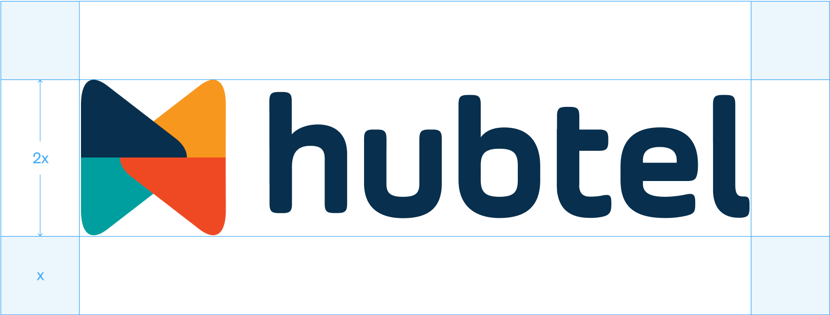
This is more than a logo. It is how we look, feel, and show up. Protecting it is everyone’s responsibility.

Bold and legible type choices that bring consistency and clarity to every Hubtel product.

“Our north star for creating meaningful experiences loved across Africa.”
Every part of Butterfly is guided by five key principles that shape how we design, build, and maintain consistency across products.
Our color palette reflects our personality; simple and vibrant.
This is more than a logo. It is how we look, feel, and show up. Protecting it is everyone’s responsibility.
Clear, confident, and human — our voice reflects who we are: bold, helpful, and rooted in purpose.

Bold and legible type choices that bring consistency and clarity to every Hubtel product.
A shared visual style that helps us communicate with clarity, purpose, and a strong sense of identity.
Capturing real moments that reflect the warmth and humanity of the people we serve.
Tools and files to help you design and build the Hubtel way.
Sora

Our approved typefaces for digital and print
Official color palette and usage rules to keep every design vibrant and recognisably Hubtel.

Templates and assets to help you create clear, on-brand decks and internal visuals.
A curated library of brand illustrations to add personality and storytelling to your designs.
Downloadable logos and usage guidelines to protect and present the Hubtel brand correctly.